
HORN, Roni
SPECIAL ORDER. PRICING & AVAILABILITY SUBJECT TO CHANGE. Price is net to all; promotional discounts do not apply. First edition, first printing. Limited edition of 100 copies, signed and numbered on the front of the folio in black ink by Horn. Four unbound sheets, plus a title page, contained in a dark gray trifold folio with title printed in black on front. The sheets consist of 3 four-color plates and a "map" of place names. 14 x 11 inches. Extremely scarce. As New (from the artist's archive). From Roni Horn (in a 1995 interview with Claudia Spinelli): "The entrance to all my work is the idea of an encyclopedia of identity. It is best represented by the books, the series called To Place, which is extremely important to me. I have been working on this since 1988. It's really the heart. It is a series of books, each one of which adds to the whole in a way that alters the identity of it retroactively. So the first volume appears to be a book of drawings. The second book was about a completely different subject but in the same format. With the third volume people start to realize something: 'Well, this looks like a series, so there must be some relationship. But I haven't a clue as to what it is.' Then there was the fourth volume, with texts and photographs. The books are this very slow process of accumulation in the period of a life, my life." Signed by Author.

HORN, Roni
First edition, first and only printing. Hardcover. Special limited edition of 150 copies, with an original print (10 1/4 x 12 1/2 inches), numbered and signed in graphite by Horn (this being #128/150), folded and attached at the spine verso the first sheet of the book. The image of the print is of a topological map of Iceland, with red printed hand-written text by Horn forming a circular pattern over the map. The print is vertically folded twice to fit within the book's dimensions. Black linen cloth with blind-stamped title, in a matching black linen cloth slipcase, no dust jacket as issued. Out of print. Very scarce. Watercolor and/or graphite drawings by Roni Horn (reproduced actual size). Designed by Roni Horn in consultation with Klaus Baumgärtner. 36 pp., with 14 four-color plates, beautifully printed on heavy fine matte art paper by Drukkerij Rosbeek bv, in Nuth, the Netherlands. 10-1/2 x 8-3/8 inches. This first edition was limited to 1150 hardbound copies. [Cited in Andrew Roth, ed., The Open Book. (Göteborg, Sweden: Hasselblad Center in association with Steidl Verlag, Göttingen, Germany, 2004), and in Martin Parr and Gerry Badger, The Photobook: A History, Volume II. (London and New York: Phaidon, 2006).]. As New in publisher's original packaging (book and print in flawless, pristine condition). These watercolor and graphite drawings were produced in 1982 during a two-month stay in a lighthouse off the southern coast of Iceland. This is the first volume in the series of the work, To Place. To Place is an ongoing series of publications. Each volume is a unique dialogue addressing the relationship between identity and place. The books take as their starting point Iceland and the evolving experiences of the artist in this country. From Roni Horn (in a 1995 interview with Claudia Spinelli): "The entrance to all my work is the idea of an encyclopedia of identity. It is best represented by the books, the series called To Place, which is extremely important to me. I have been working on this since 1988. It's really the heart. It is a series of books, each one of which adds to the whole in a way that alters the identity of it retroactively. So the first volume appears to be a book of drawings. The second book was about a completely different subject but in the same format. With the third volume people start to realize something: 'Well, this looks like a series, so there must be some relationship. But I haven't a clue as to what it is.' Then there was the fourth volume, with texts and photographs. The books are this very slow process of accumulation in the period of a life, my life." Signed by Author.
HORN, Roni
Special limited edition of 100 copies + 20 Artist's Proofs/AP (this being #19/20), with a two-sided offset print on heavy matt paper (image size 7-1/2 x 9-1/2 inches; paper size 8 x 12 inches), signed and numbered on one side in graphite by Horn and contained in a glassine folder. About the book: First edition, first and only printing. Unbound, photographically illustrated cards contained in an aubergine cloth-covered clamshell box, with title stamped in black on the cover. Photographs by Roni Horn. Unpaginated, with 56 four-color plates printed full-bleed on heavy matt cardstock by Steidl. 10-1/2 x 8-1/2 inches. This is the ninth volume in the series of the work, To Place. Out of print. Scarce. To Place is an ongoing series of publications. Each volume is a unique dialogue addressing the relationship between identity and place. The books take as their starting point Iceland and the evolving experiences of the artist in this country. [Cited in Andrew Roth, ed., The Open Book. (Göteborg, Sweden: Hasselblad Center in association with Steidl Verlag, Göttingen, Germany, 2004), and in Martin Parr and Gerry Badger, The Photobook: A History, Volume II. (London and New York: Phaidon, 2006).]. As New in publisher's original packaging (from the artist's archive). Book, clamshell box and print are flawless. From the publisher: "A collection of two-sided images, a set of cards. One face -- the glacial river Skaftá: changing and constant. One face -- a collection of possibilities: instances of . a boy, an iceberg or two, some birds. Each card offers a hybrid or composite -- but the collection suggests the duplicitous nature of identity." From Roni Horn (in a 1995 interview with Claudia Spinelli): "The entrance to all my work is the idea of an encyclopedia of identity. It is best represented by the books, the series called To Place, which is extremely important to me. I have been working on this since 1988. It's really the heart. It is a series of books, each one of which adds to the whole in a way that alters the identity of it retroactively. So the first volume appears to be a book of drawings. The second book was about a completely different subject but in the same format. With the third volume people start to realize something: 'Well, this looks like a series, so there must be some relationship. But I haven't a clue as to what it is.' Then there was the fourth volume, with texts and photographs. The books are this very slow process of accumulation in the period of a life, my life." Signed by Author.
HORN, Roni
Price is net to all; promotional discounts do not apply. Special limited edition of 100 copies with an original algraphy print on 150g uncoated paper, signed and numbered in pencil on verso by Horn. The print, contained in a folder, is presented with a copy of the book in an embossed cloth slipcase, in a numbered edition of 100. About the book: First edition, first and only printing. Signed, numbered and dated ("2023") in graphite on the half-title page by Horn. Hardcover. Fine linen cloth with embossed title, no dust jacket as issued. Photographs by Roni Horn. 80 pp., with 62 four-color plates, beautifully printed on heavy fine matte art paper by Steidl Verlag. 10-1/2 x 8-3/8 inches. [To Place Series cited in Andrew Roth, ed., The Open Book. (Göteborg, Sweden: Hasselblad Center in association with Steidl Verlag, Göttingen, Germany, 2004), and in Martin Parr and Gerry Badger, The Photobook: A History, Volume II. (London and New York: Phaidon, 2006).]. New in publisher's packaging. This is the eleventh volume in the series of the work, To Place. To Place is an ongoing series of publications. Each volume is a unique dialogue addressing the relationship between identity and place. The books take as their starting point Iceland and the evolving experiences of the artist in this country. From the publisher: "In the south of Iceland is Landbrot, whose geologic particulars present a unique landscape. It is a place closer to fairy tales than to science, indeed a place easy to imagine as the singular source of fairies and elves worldwide. It is easy, too, to imagine the sensual comfort and satisfaction to be found there. Mother, Wonder is the eleventh book in Horn's ongoing series "To Place," which she initiated in 1989 and exists only in book form. All the volumes focus on Iceland and the evolving experiences of the artist there; together they form a flowing dialogue addressing the relationship between identity and place. The titles to date in the coveted "To Place" encyclopedia are Bluff Life (1990), Folds (1991), Lava (1992), Pooling Waters (1994), Verne's Journey (1995), Haraldsdóttir (1996), Arctic Circles (1998), Becoming a Landscape (2001), Doubt Box (2006) and Haraldsdóttir, Part Two (2011)." From Roni Horn (in a 1995 interview with Claudia Spinelli): Spinelli: "Compared to your installations, looking at and reading books is a very private way of confrontation." Horn: "It's very intimate. A book is really a sensual, if not sexual experience and I use these books to focus people in this very intimate one-on-one relationship. The book can become a kind of mirror. The book has an inside and an outside. (A lot of things don't have that. They have only outsides; images for example.) And then you enter it and it has a fixed sequence. It has a before and an after, there is a narrative implicit in it. So all that is part of the structure that I'm using. I'm working on the sixth volume now which is completely different again. It focuses on one woman, exclusively. It's about the face as place. It's a sequence of very tight head shots. I was photographing Margrét outdoors and in water. The water and the weather became very important as the visual context. Water and weather are dominant phenomena in Iceland. So we would travel and I would photograph her in the water and in the weather. It was a very simple relationship: I didn't tell her to do anything, she would just get into the water and I would photograph her. In the sunlight and with the clouds under the open, forceful sky--the water was all around her, on her, and in her hair, and in the air as well." Horn: "The entrance to all my work is the idea of an encyclopedia of identity. It is best represented by the books, the series called To Place, which is extremely important to me. I have been working on this since 1988. It's really the heart. It is a series of books, each one of which adds to the whole in a way that alters the identity of it retroactively. So the first volume appears to
MORIYAMA, Daido, FEIL, Marcel
First edition, first printing. Hardcover. Special limited edition of 40 (this being #28/40), with a gelatin silver print, in a black paper folio with titled embossed in pink. Book and print (in folder) housed in a velvet-covered clamshell box. The silver print image size is 6-5/8 x 9-1/4 inches; paper size 8 x 10 inches, and is signed and numbered on verso in pencil by Moriyama (the photograh was made in the 1970s and printed in 2003. ABOUT THE BOOK: Photographically illustrated paper-covered boards with printed obi, no dust jacket as issued. Boldly signed (in Japanese and English) in black marker opposite the title page by Moriyama. Photographs by Daido Moriyama. Essay by Marcel Feil. Design by Alex Daniels. 104 pp., with 78 black and white plates (most 2-page spreads), finely printed by Meco Offset BV, Zwaag, The Netherlands. 9-3/4 x 6-6/8 inches. This first trade edition was limited to 1000 copies. Out of print. Very scarce. As New. Signed by Author.
HORN, Roni
Special limited edition of 100 copies + 25 Artist's Proof copies (this being AP #14/25), with an original archival pigment print (image size 9-1/2 x 7-1/2 inches; paper size 9-7/8 x 7-7/8 inches), signed in pencil recto by Horn and numbered verso in pencil. The laid-in print and book are contained in a matching cloth-covered slipcase. About the book: First edition, first and only printing. Hardcover. Fine bright blue linen cloth with debossed title in black, no dust jacket as issued. Photographs by Roni Horn. 144 pp., with 100 four-color and tritone plates, beautifully printed on heavy fine matte art paper by Steidl Verlag. 11 x 8-5/8 inches. This first edition was limited to 1000 hardbound copies (100 of which were reserved for this special Limited Edition, with print). Out of print. Scarce. [Cited in Andrew Roth, ed., The Open Book. (Göteborg, Sweden: Hasselblad Center in association with Steidl Verlag, Göttingen, Germany, 2004), and in Martin Parr and Gerry Badger, The Photobook: A History, Volume II. (London and New York: Phaidon, 2006).]. As New in publisher's original packaging (from the artist's archive). Book, slipcase and print are flawless. Using water as context, photographs of a woman create an intimate but ambiguous portrait where the face becomes the place. This is the tenth volume in the series of the work, To Place (It is related to Haraldsdóttir, which was published in 1996 by Ginny Williams). To Place is an ongoing series of publications. Each volume is a unique dialogue addressing the relationship between identity and place. The books take as their starting point Iceland and the evolving experiences of the artist in this country. From Roni Horn (in a 1995 interview with Claudia Spinelli): Spinelli: "Compared to your installations, looking at and reading books is a very private way of confrontation." Horn: "It's very intimate. A book is really a sensual, if not sexual experience and I use these books to focus people in this very intimate one-on-one relationship. The book can become a kind of mirror. The book has an inside and an outside. (A lot of things don't have that. They have only outsides; images for example.) And then you enter it and it has a fixed sequence. It has a before and an after, there is a narrative implicit in it. So all that is part of the structure that I'm using. I'm working on the sixth volume now which is completely different again. It focuses on one woman, exclusively. It's about the face as place. It's a sequence of very tight head shots. I was photographing Margrét outdoors and in water. The water and the weather became very important as the visual context. Water and weather are dominant phenomena in Iceland. So we would travel and I would photograph her in the water and in the weather. It was a very simple relationship: I didn't tell her to do anything, she would just get into the water and I would photograph her. In the sunlight and with the clouds under the open, forceful sky--the water was all around her, on her, and in her hair, and in the air as well." Horn: "The entrance to all my work is the idea of an encyclopedia of identity. It is best represented by the books, the series called To Place, which is extremely important to me. I have been working on this since 1988. It's really the heart. It is a series of books, each one of which adds to the whole in a way that alters the identity of it retroactively. So the first volume appears to be a book of drawings. The second book was about a completely different subject but in the same format. With the third volume people start to realize something: 'Well, this looks like a series, so there must be some relationship. But I haven't a clue as to what it is.' Then there was the fourth volume, with texts and photographs. The books are this very slow process of accumulation in the period of a life, my life." From the publisher: "In 1996, [Ginny Williams] published Roni Horn's Haraldsdóttir, the tenth book in her "To Place" series about the
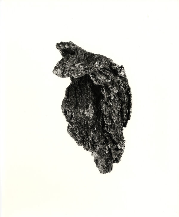
HORN, Roni
Special limited edition of 100 copies (this being #78/100), with an original gelatin silver print (8 x 10 inches), numbered and signed in pencil on verso by Horn. The print is enclosed in 3 special additional folding orange endpapers attached to the rear inside board of the book and presented with a copy of the book in an embossed cloth slipcase, in a numbered edition of 100. About the book: First edition, first and only printing. Hardbound. Black linen cloth with blind-stamped title, no dust jacket as issued. Photographs of lava (reproduced actual size) and text by Roni Horn, with studio photography by Morgan Rockhill, Providence, Rhode Island. Designed by Roni Horn and Anthony McCall Associates, New York. 96 pp., with 45 four-color and black and white plates, beautifully printed on heavy fine matt art paper. 10 1/2 x 8 3/8 inches. The lava used to make the images was collected in Iceland between 1979 and 1991. This is the third volume in the series of the work, To Place. Out of print. Very scarce. To Place is an ongoing series of publications. Each volume is a unique dialogue addressing the relationship between identity and place. The books take as their starting point Iceland and the evolving experiences of the artist in this country. [Cited in Andrew Roth, ed., The Open Book. (Göteborg, Sweden: Hasselblad Center in association with Steidl Verlag, Göttingen, Germany, 2004), and in Martin Parr and Gerry Badger, The Photobook: A History, Volume II. (London and New York: Phaidon, 2006).]. As New in publisher's original packaging (from the artist's archive). Book, slipcase and print are flawless. From Roni Horn (in a 1995 interview with Claudia Spinelli): "The entrance to all my work is the idea of an encyclopedia of identity. It is best represented by the books, the series called To Place, which is extremely important to me. I have been working on this since 1988. It's really the heart. It is a series of books, each one of which adds to the whole in a way that alters the identity of it retroactively. So the first volume appears to be a book of drawings. The second book was about a completely different subject but in the same format. With the third volume people start to realize something: 'Well, this looks like a series, so there must be some relationship. But I haven't a clue as to what it is.' Then there was the fourth volume, with texts and photographs. The books are this very slow process of accumulation in the period of a life, my life." Signed by Author.
BURKE, Bill
First edition, first printing. Special limited edition of 75 copies, signed by Burke, in a black linen slipcase (with blind-stamped land mine shapes and red printed label tipped in), lacking the original 10 x 8 inch gelatin silver print. Signed in ink opposite the title page by Burke (under his self-portrait). Hardcover. Photographically illustrated laminated paper-covered boards, no dust jacket as issued. 118 pp., with 95 duotone and numerous color reproductions, including two 2-page gatefolds (photographs, video stills, journal entries, film stills and other illustrations, from Burke's trips to Cambodia since 1982). 11-1/4 x 8-7/8 inches. Out of print. As New. Burke designed the book entirely in the offset printing medium, without computer resources. Also included with the book is a booklet 16-page journal/book insert (8 1/8 x 5 3/8 inches) with illustrations of samples from Burke's personal journals, and including 11 black and white reproductions of Polaroid prints. From the publisher: "Mine Fields (a sequel to Bill Burke's justly famous I Want to Take Picture), is Burke's scrapbook of his life and his pursuit of the history and daily life of Cambodia. Part adventure story, part personal confession, part travelogue, and always fascinating, Burke's negotiation of the mine fields of divorce and war is a compelling collage of photographs, found objects, stories, and the contrast between glorious ancient temples and the horrors of war and genocide." About Bill Burke: Since the early 1980s, Bill Burke has photographed extensively in Southeast Asia, focusing primarily in Cambodia, Laos and Vietnam. Burke's haunting and layered examination of the landscape and people is informed by the collective political and social conscience galvanized by the United States' lengthy occupation and annihilation of these regions before, during, and after the Vietnam War. His lifelong desire to connect personally and viscerally to the people he meets sets his work in an altogether separate category from most artists who photograph outside their circumscribed "experience." Neither overtly political nor proscriptive, Burke's work instead recognizes the personal is indeed political. Gone are the cultural stereotypes we have long seen in images of Southeast Asia. Instead we are able to experience the intensity of the individual through Bill Burke's idiosyncratic and careful observation. He obliterates the notion that the "documentary photograph" is a vehicle for "truth" and compellingly shows the viewer that it is always a form of personal or political propaganda. 'I Want to Take Picture' (originally published by Nexus Press in 1987) is a combination artist book and 'travelogue.' It is considered by many to be one of the very best, disturbing and important books in the history of photography. From Bill Burke (1987): "Each day, I was thinking about practicality, is my pass in order, how do I get there, who do I meet that will get me through. The philosophical thoughts came later. When I realized that I had access to the camps and could see the Khmer Rouge, it was like being able to see the Devil. It seamed to be an incredible opportunity." From an interview with Bill Burke by Willis Hartshorn (New York City, June 1987): "Hartshorn: 'Do you find it problematic that in a politically savage environment your pictures are often ambiguous as to who's good and who's bad?' Burke: 'I have no problem with ambiguity. Again, all the information is filtered, everything I know about it is secondhand. I know what the refugees at the border say and what books say. I heard how bad the Khmer Rouge were, and then as I read more I found out the other people had been bad too. The people who were victims at one time were victimizing others at another time. There are two sides, the information is slanted, and it's good that people understand that. . . I would like things to be spelled out clearly so I wouldn't have to think about it. But that's not the way it is. I can't say
MÜLLER, Karin Apollonia
First edition, first printing. Signed in black ink on the half-title page by Müller. Hardcover. Fine gray cloth-covered boards with tipped-in four-color plate on cover and printed vellum dust jacket. Photographs by Karin Apollonia Müller. Unpaginated (48 pp.), with 28 four-color plates beautifully printed on fine matt art paper. 12-1/4 x 14-7/8 inches. This first edition was limited to 500 copies. New (opened only for signature). From the publisher: "On Edge is Karin Apollonia Müller's second monograph, and the first to be published by Nazraeli Press. While Angels in Fall (2001) dealt with the disconnect between human beings and their environment, On Edge shows the earth 'crumbling away,' and our futile efforts to control or hide the subtle invasion of nature into cultivated spaces. Working in color with a muted palette and low contrast, Müller creates powerful images which evoke a sense of displacement in keeping with the artist's 'visitor status' as a foreigner in Los Angeles. Born in Heidelberg in 1963, Müller grew up as the daughter of a sea captain. She studied photography and film at the University of Essen before moving to the western United States in 1995. Karin Apollonia Müller's work has been widely exhibited in the United States and Europe, and is included in such collections as The Museum of Modern Art, New York; the Whitney Museum, New York; and the San Francisco Museum of Modern Art." Signed by Author.
PULLEN, Melanie, CRISELL, Luke, ENRIGHT, Robert, WESTERBECK, Colin
First edition, first printing. Signed, dated and noted ("L.A. 2007") in black in on the title page by Pullen. Hardcover. Photographically illustrated paper-covered boards with title printed on cover and spine, with matching dust jacket. Photographs and text by Melanie Pullen. Foreword by Luke Crisell. Essays by Robert Enright and Colin Westerbeck. Includes thumbnail reproductions and titles of the plates. 128 pp., with 57 varnished four-color plates beautifully printed on fine matt art paper. 14 1/4 x 11 1/4 inches. This first was edition limited to 3000 hardbound copies. As New in As New dust jacket (publisher's original shrink-wrap laid-in, opened only for signature). From the publisher: "Melanie Pullen's long-awaited first monograph, High Fashion Crime Scenes, presents her breathtakingly beautiful works based on vintage crime scene images, first-hand accounts, and documents Pullen mined from the files of the L.A.P.D. In 2002, drawn to the rich details and compelling stories preserved in the criminal records, Melanie Pullen began restaging the events, outfitting the 'victims' (her selected models) in current haute couture, and photographing them in her staged settings. To create this work, Pullen at times enlisted the help of up to sixty people per shoot: set builders, makeup artists, models, stylists and stunt crews, among others. Her models have included the actresses Rachel Miner and Juliette Lewis. The collection of more than one hundred images has received considerable critical acclaim in the national and international press. Over the past three years, the twenty-nine year old artist has occasionally worked as a commercial fashion photographer. She has shot layouts for the likes of Flaunt and Rolling Stone." Signed by Author.
SPECIAL ORDER. PRICING & AVAILABILITY SUBJECT TO CHANGE. Price is net to all; promotional discounts do not apply. First edition, first printing. Limited edition of 100 copies, signed and numbered on the front of the folio in black ink by Horn. Four unbound sheets, plus a title page, contained in a dark gray trifold folio with title printed in black on front. The sheets consist of 3 four-color plates and a "map" of place names. 14 x 11 inches. Extremely scarce. As New (from the artist's archive). From Roni Horn (in a 1995 interview with Claudia Spinelli): "The entrance to all my work is the idea of an encyclopedia of identity. It is best represented by the books, the series called To Place, which is extremely important to me. I have been working on this since 1988. It's really the heart. It is a series of books, each one of which adds to the whole in a way that alters the identity of it retroactively. So the first volume appears to be a book of drawings. The second book was about a completely different subject but in the same format. With the third volume people start to realize something: 'Well, this looks like a series, so there must be some relationship. But I haven't a clue as to what it is.' Then there was the fourth volume, with texts and photographs. The books are this very slow process of accumulation in the period of a life, my life." Signed by Author.


![On Edge: Photographs by Karin Apollonia Müller [SIGNED]](https://rarebookinsider.com/wp-content/uploads/2024/06/31723497564.jpg)
![Melanie Pullen: High Fashion Crime Scenes [SIGNED]](https://rarebookinsider.com/wp-content/uploads/2024/06/31723490706.jpg)