![Refranes o Proverbios Españoles traduzidos en lengua Francesa. Proverbes Espagnols traduites en François. [Part 2:] GARAY](https://rarebookinsider.com/wp-content/uploads/2024/03/1562862987.0.l.jpg)
OUDIN, César (ca. 1560-1625)
Lyon, 1614
Lyon: Pierre Rigaud, 1614. 12mo (132 x 70 mm). [2], 376 pages (last 3 blank leaves removed). 2 parts, separately titled but continuously signed and paginated. Spanish text in roman types, French translation in italic. Pagination errors, signatures with crooked sorts on h4r and h6r. Woodcut printer's device on general title, a metalcut headpiece, woodcut initials. Upper margins cut close, shaving a couple of headlines. 19th-century brown morocco, bound for William Stirling Maxwell, with two different blind-stamped monograms on covers, spine gilt lettered, gilt edges, red endpapers (upper joint broken). Provenance: William Stirling Maxwell (1818-1878), supralibros, Keir House "Proverbs" collection bookplate (rear pastedown), small armorial bookplate with his "I am ready," etc. mottos (front pastedown); with Quaritch, collation note 1958; with Maggs, 1993, catalogue 1160, no. 27; Kenneth Rapoport, bookplate.***
Only Lyonese edition of a popular collection of over 2000 Castilian proverbs with French translations, first published in 1605, by a lexicographer, royal interpreter, and the first translator of any part of Don Quixote into French (part 1, published the same year as this edition). For each proverb the Spanish and French texts are printed together in one paragraph, differentiated by their type fonts. Gratet-Duplessis praised Oudin's proverb collection as the best French source for Spanish proverbs, noting the precision of the French translations, and the utility of Oudin's short explanatory notes.
Pierre Rigaud, the printer of this edition, did not do the text justice; frequent incorrect spellings and weird punctuation occasionally render either the translations or the originals nonsensical (e.g., "La mujer que poco hila, sempre trae mala camisa" is translated as "La femme qui peut filer [instead of peu file], toujours, porte meschante chemise" - p. 95).
This edition follows the Brussels 1608 edition in adding a second part, containing a 16th-century epistolary jeu d'esprit by the inventor Blasco de Garay: a series of letters composed entirely of proverbs and aphorisms. It concludes with the Dialogo entre un viejo e amor, a dramatic poem first published in 1511, attributed to Rodrigo Cota de Maguaque, in which Love persuades an old man who had been resigned to his solitude to try again, and then proceeds to mock him cruelly.
An appealing copy of a scarce edition. USTC, OCLC and NUC give 4 US locations (Hispanic Society, UC Berkeley, NYPL and U. Penn).
Palau 207295; USTC 5005619 & 6901883; Gratet-Duplessis, Bibliographie parémiologique 495 (1659 edition).
![Refranes o Proverbios en Romance. [Part 2:] MAL LARA](https://rarebookinsider.com/wp-content/uploads/2024/03/1562862981.0.l.jpg)
NUÑEZ DE GUZMAN, Hernán (1474?-1553)
Madrid, 1619
Madrid: por Juan de la Cuesta, a costa de Miguel Martinez, 1619. 4to (212 x 147 mm). [4], 399 leaves. 2 parts, separately titled but continuously signed and foliated. Printer's woodcut device on titles. Double column, woodcut head-piece, tail-piece, and initials. Underlining in pink and blue pencil in second part; scattered foxing, occasional marginal staining or soiling, a couple of short marginal tears due to paper flaws (M3, V1). Contemporary parchment, title ink-lettered on spine, evidence of two fore-edge ties; a few deckle edges (later endpapers). Provenance: Kenneth Rapoport, bookplate, inserted purchase notes.***
The "most complete and most useful edition" (Gratet-Duplessis) of Nuñez's vast proverb collection, first published in 1555, comprising over 8500 short sayings, including some Portuguese, French, Italian and Galician proverbs. The longer second part contains Juan de Mal Lara's Filosofia vulgar (fol. 121 ff.), a more discursive selection of proverbs, first published in 1568. Mal Lara's extensive and erudite commentary could be considered too long in places (noted Gratet-Duplessis), but it is redeemed by his wit and above all his citation of a large number of little-known Spanish poems (ibid., p. 294). The edition concludes with Garay's Cartas en refranes (see Oudin).
Iberian Books B4409; CCPB CCPB000037314-1; Palau 253490 & 197518; Salvá 2112; Heredia 2763; Gratet-Duplessis, Bibliographie parémiologique 486 (Garay p. 292).

SPONTONE, Ciro (ca. 1555-1612), attributed to
Venice & Verona, 1672
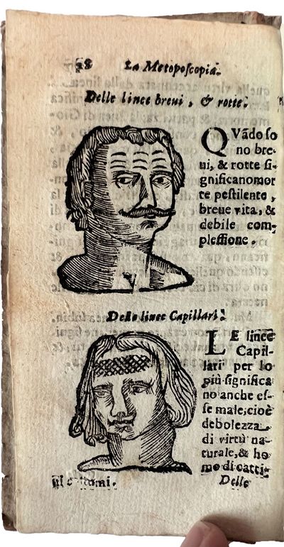
Venice & Verona: Andrea Rossi, 1672. 12mo (142 x 75 mm). Collation: A-F12 G4 (G4 blank). 150 pages. Forty-six woodcuts, of which one full-page, woodcut title ornament and initials. Wormtrack in gutter of last few leaves, affecting few letters on pp. 144-145, else a fine, fresh copy, untrimmed, in its original carta rustica binding.***
Rare pocket edition of a popular early manual of physiognomy, with crude woodcuts of male heads, all looking slightly concerned, as their simplistically lined foreheads each bear the burden of a different character type.
The work was first published in an elegant octavo edition in 1626. In the dedication of that edition, Giovanni Battista Spontoni, doctor from Peschieria, claimed to have found the work in his father's papers. Ciro Spontone (or Spontoni) served as secretary to high-placed dignitaries and diplomat; he wrote serious literary works, and this posthumously published foray into pseudo-science contrasts oddly with the rest of his oeuvre. The Dizionario biografico degli Italiani does not include it among his works. The present economically printed "popular" edition, whose poor models suffered at the hands of the remarkably unskilled wood engraver, is augmented with a short treatise on other aspects of physiognomy (the nose, the eyebrows, teeth, lips, voice, etc.) for men and women, and chapters on beauty marks and on human proportion.
ICCU ITICCUBVEE34899, a different issue(?) of this edition, with the same imprint and bibliographical fingerprint, but in which the last quire contains six leaves instead of four (3 Italian locations listed; OCLC adds Heidelberg); Caillet, Manuel bibliographique des sciences psychiques ou occultes 3: 10327.
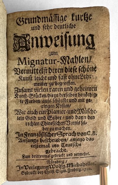
Nuremberg: Christian Sigmund Froberg for Wolfgang Michahelles, 1710. 12mo (127 x 77 mm). [16], 145, [7] pp. Gothic types. Woodcut illustration of a pantograph (p. 8). Overall discoloration, some soiling and fraying to first and last few leaves. Contemporary speckled parchment over pasteboards (worn, covers bowed and darkened).***
A popular and now commensurately rare German translation of Claude Boutet's guide to miniature painting, the Traité de Miniature pour apprendre aisément à peindre sans maître (first published [as Escole de la Mignature] in Lyon, 1666). The translator was Gregor Andreas Schmidt, whose initials appear at the end of the dedication.
A bestseller in France, Boutet's work was translated successively into German (first 1688), Italian (1703) and English (1729). Boutet's goal in writing the work, he explains in the foreword, was to provide a guide for those lacking the opportunity for personal instruction in technical matters, such as nuns, or "persons of standing" who seek a pleasant diversion for their leisure hours. For the amateur, therefore, he lauds the superiority of miniature painting over other types, noting that it is far more delicate than regular painting, is to be viewed up close, and can only be executed on vellum or similar material. For those who cannot paint he provides instructions for scaling, including the fairly recently invented pantograph (illustrated though not named). The work contains detailed directions for preparing the pigments, color by color, and discussions of the brush, proper lighting, blending of paints and colors, painting techniques, and appropriate colors and techniques to use for backgrounds, day and night skies, clouds, halos and aureoles. Separate sections, subdivided into chapters, are devoted to the coloring and techniques for textiles and clothing, skin and various body parts, flames and smoke, landscapes, and flowers. The last, miscellaneous section contains various "secret" recipes for lacquers, gold and silver paint, purification of vermilion, etc.
The translator attempted to follow the French text closely, but his printers did not always cooperate: for example, in the foreword, in an allusion to painting treatises, "da Vinci [and] Fresnoy" have become a single writer-artist named "Vinci du Gresnoy." This error appeared as well in the first German edition (Nuremberg: Endter, 1688), of which the 1702, 1703, and the present 1710 editions are faithful copies. I locate no copies of any of the early German editions in American libraries. There are copies of the Leipzig 1753 edition (under a slightly variant title, Anweisung zum Mignaturmahlen...) at the Getty, and of the 1766 edition at Queen's University Library (Ontario).
VD18 1299331X; Holzmann & Bohatta, Deutsches Anonymen-Lexikon I, 2639 (1688 edition); Schiessl, Die deutschsprachige Literatur zu Werkstoffen und Techniken der Malerei von 1530 bis ca. 1950 (1989), 581-585.